Data Science for Economists.
GDP
The first chart tracks quarterly GDP in the UK
Labour Market
The second chart looks at the unemployment rate of 25-49 year olds in the UK
IMF Loans
Week 2 portfolio charts
Adjusted for inflation, it would seem that 2020 is still the riskiest year.
However, IMF debt is far more stable year on year when adjusted.
Who Americans spend their time with, by age
Week 3 portfolio charts
Changing the encoding from a line graph to a stacked line graph enables easier comparison of magnitudes, and results in a simpler appearance
NBA Team Payrolls 2011 - 2022
Week 4 portfolio chart
Spotrac was chosen in order to quickly aggregate data from different tables for multiple years
UK Labour Market Dashboard - ONS
Week 5 portfolio charts
Maps of Hong Kong's Administrative Districts
Week 7 portfolio charts
This map shows the extreme state of regional inequality in Hong Kong
"Behaviour Change from Smart Meter Usage is the most important factor in reducing Energy Consumption"
Week 8 portfolio charts
Over sample countries, the relationship between smart meter usage and energy consumption is currently unclear.
NBA Salaries on Win Share
Week 9 portfolio charts
Predicting NBA playoff performance via linear regression
Week 10-11 portfolio charts
Hypothesis: Using data from the modern NBA, can playoff performance be accurately predicted for the 2022/23 season?
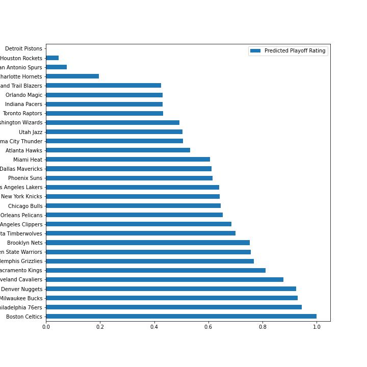
The team with most wins currently does not have the highest predicted rating, rather the Denver Nuggets is highest rated given their high shooting efficiency.
Jupyter Notebook
Predicting positions of NBA players
Hypothesis: Determining whether there is any significant clustering of NBA player statistics based on player position
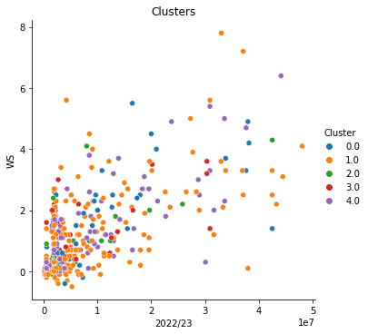
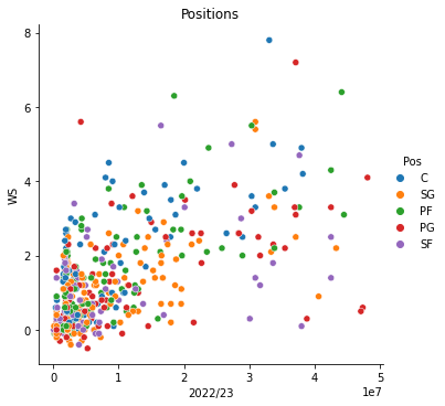
There is little similarity between predicted catagories and positions (correlation of -.02), as such there is no significant clustering based on position.
Jupyter Notebook